The “nudge theory” is suggesting that it is possible to influence decision-making and behaviour through positive reinforcement and indirect guidance, a kind of soft nudge. What if we look at school architecture and design through the lens of nudging? What more positive behaviour and more beneficial choices can be encouraged through design and how? What examples do we know?
Richard Thaler, winner of the 2017 Nobel Prize in Economics, together with Cass Sunstein, proposed the concept of an “architecture of choice.” It aims to improve decision-making by ordinary people by presenting information in a special format. The goal is to reduce erroneous and irrational choices, including in the areas of health and finance, without imposing restrictions.
The authors and their followers analyse these and other examples of “choice architecture” within the broader framework of “nudge theory”: the concept suggesting that it is possible to influence decision-making and behaviour through positive reinforcement and indirect guidance, a kind of soft nudge.
An apparently canonical example of nudging is the use of “urinal targets” in restrooms of airports, stadiums, universities, and schools. The idea behind urinal targets is that by putting images of insects (e.g. a small fly), mini-football goals, spiral mills, and other small targets in urinals, it is possible to reduce toilet dirtying by up to 80% and significantly save on cleaning. Alternatively, one can recall the locks on shopping trolleys, which force megamarket customers to return the trolleys from the parking lot to the shop on their own to get their 10-ruble coin back. That’s a nudge, too.
Moreover, if you have seen the movie “Super Size Me”, you might notice that it is also partly about nudging, but in the fast food industry: when buying food, you may not have thought about taking a bigger portion, but one simple question from the cashier can significantly change your plans and increase the company’s profit.
But what if we look at school architecture and design through the lens of nudging? What more positive behaviour and more beneficial choices can be encouraged through design and how? What examples do we know?
Five ways
Some research suggests considering five mechanisms for applying nudging in the architecture of public buildings:
1. Functional design is the ability of design elements to increase (and if necessary, decrease) the likelihood of using objects in the environment. Consequently, users will perform more (or fewer) actions with the object, i.e. their behaviour will change.
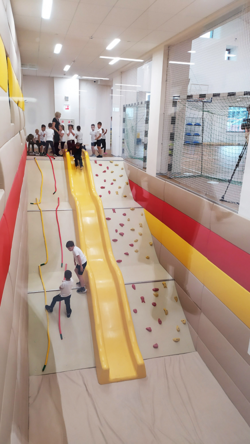
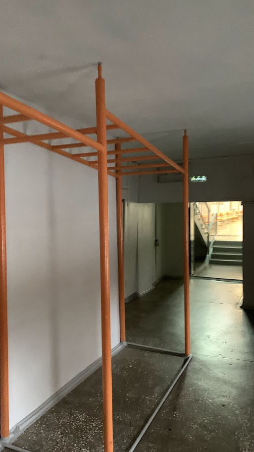
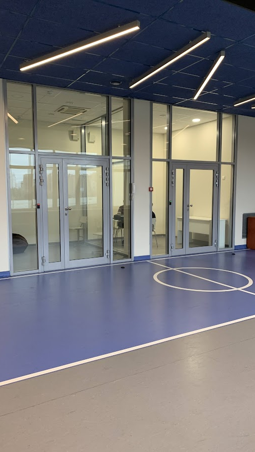
Examples of such solutions in schools include the location of sports simulators or musical instruments, board games, various game markings (hopscotch, mazes, animal tracks, football fields, running tracks, “squares”, etc.), elements of climbing walls, swings, ropes, etc. in public spaces and on the traffic path, which potentially increases mobility and physical activity of school building users. Probably one of the most comprehensive examples of such solutions is the Ku.Be House of Culture and Movement. Having a rack “parking lot” for student backpacks in front of a canteen or engineering range will increase the likelihood that backpacks will not be scattered on the floor.
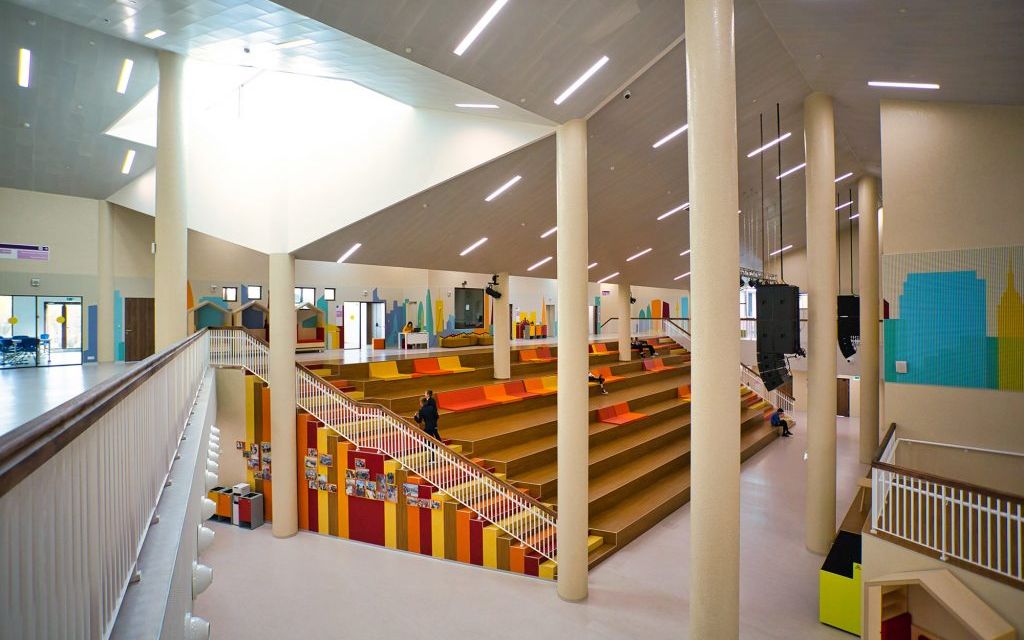
On the photo: A climbing wall at the Point of the Future, Monkey bars at a Divnogorsk school, The football area at the New School
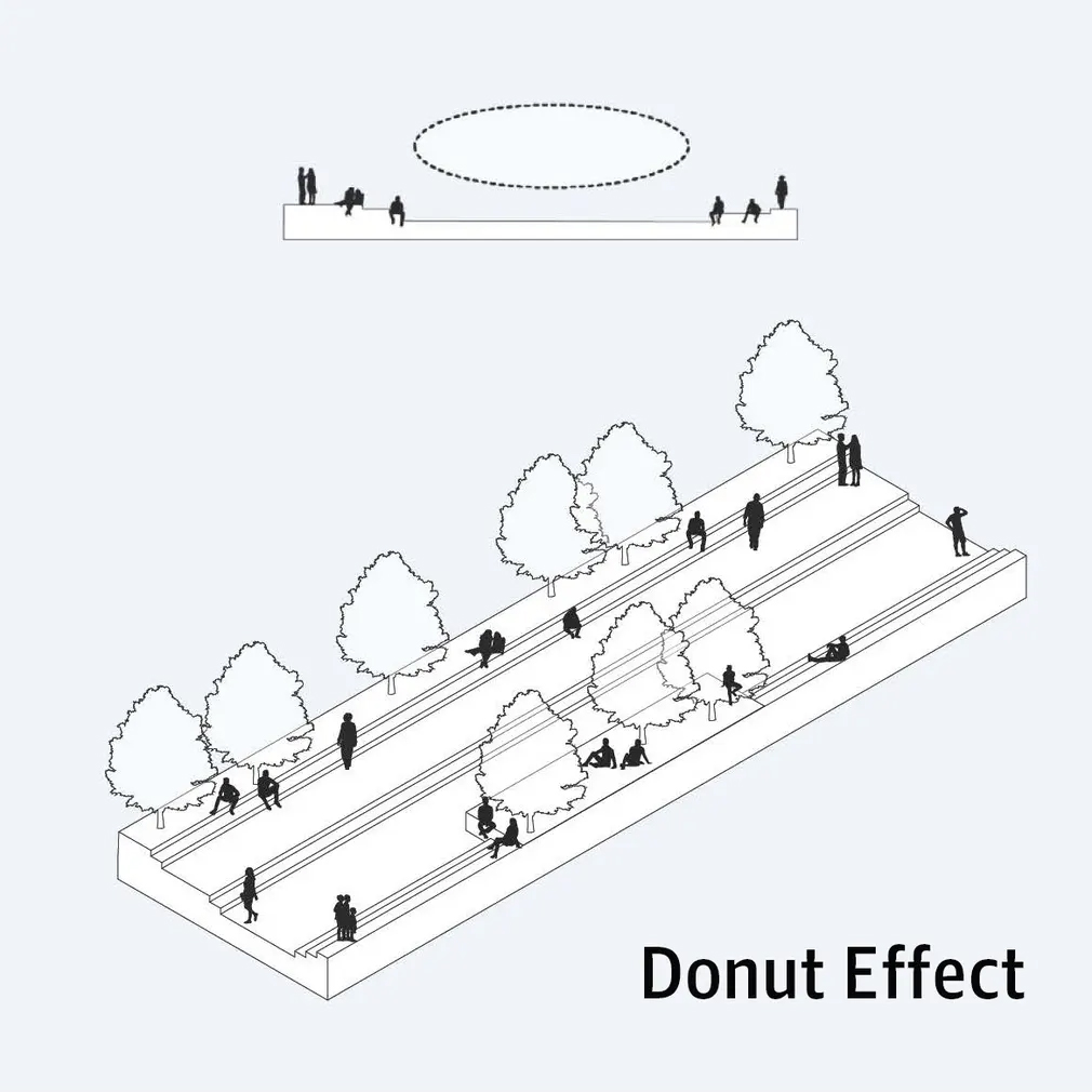
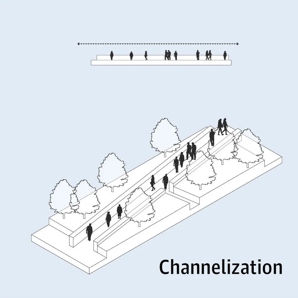
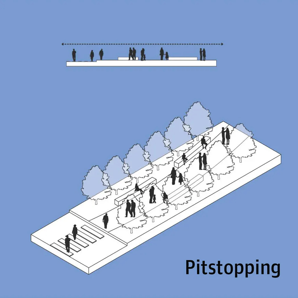
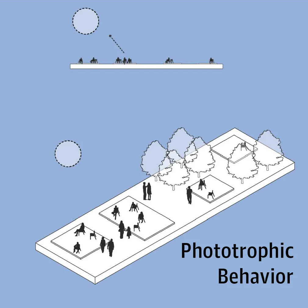
Vivid examples of modulating user behaviour in landscape architecture can be found in the well-known material from SWA Group. Human tendency not to occupy the centre of a sphere, the acceleration of movement in the absence of alternative paths, human tendency to gather at viewpoints: all these patterns can be considered in the design of the school grounds.
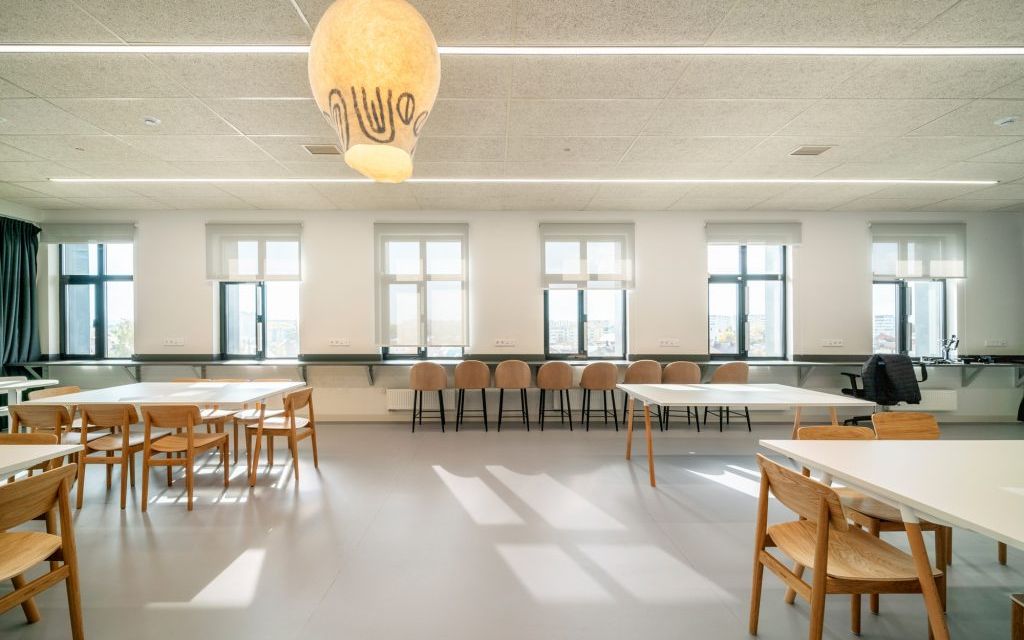
2. Creating an atmosphere is the ability to modulate emotional state and mood using design, which again can influence behaviour. For instance, there is an opinion that intense bright light, active wall colour and dynamic music in fast food establishments are designed to increase the footfall of the establishment. This is the difference between fast food and classic cafes and restaurants, where a pleasant semi-darkness and unobtrusive atmosphere makes you want to stay longer (which, by the way, also works for the institution, as it potentially increases the average cheque).
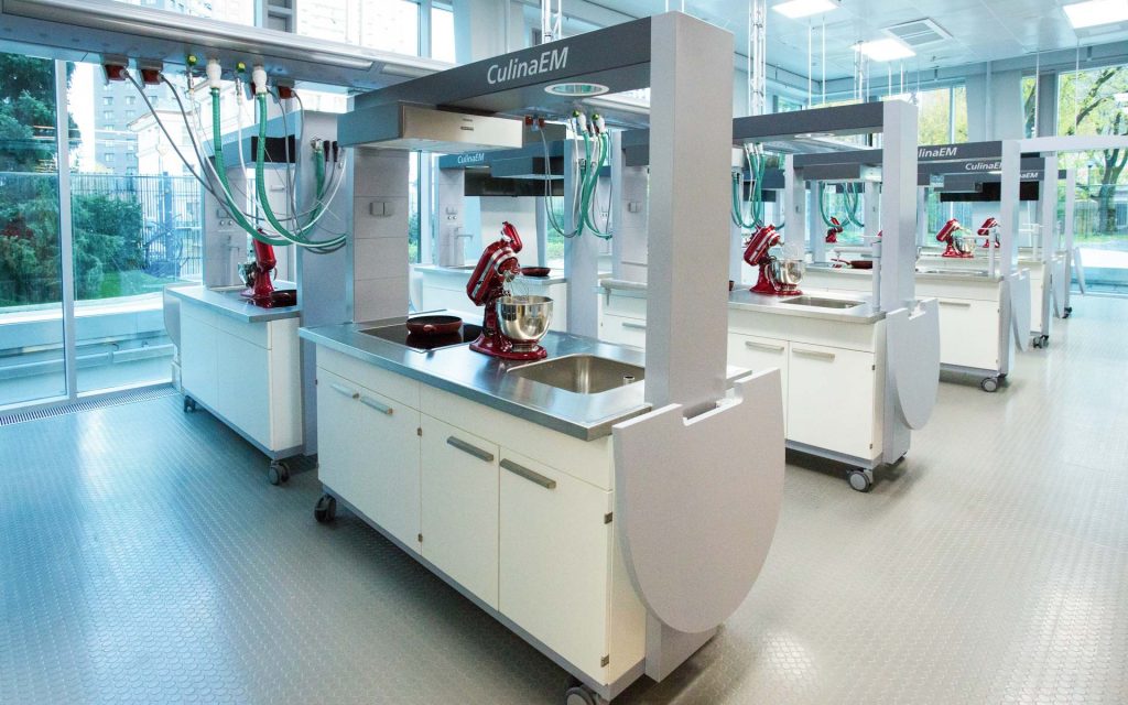
Examples of such solutions in school architecture include different approaches and strategies for equipping specialised learning spaces, such as cookery rooms or libraries. Creating a homely atmosphere, soft areas, and local illumination can encourage users to spend more time in more comfortable spaces, reenacting scenes from home kitchens, anti-cafés or other third places.
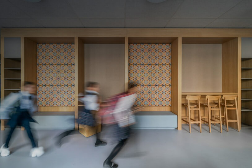
And having public quiet areas in the school where users come to work on a task in a focused manner (sometimes referred to as “botoshnaya”, or “cram den”), due to a kind of social facilitation effect, can help a large proportion of students become more focused for longer periods of time. Pictures of smiling people placed on stairwells can modulate a more positive mood for users of the school building.
Photo: reading areas Lyceum No. 1 named after M. K. Tagirov, New School Cookery, School “Point of the Future”
3. Feedback presupposes the ability of the environment to provide users with feedback on their actions or conditions, thereby changing their behaviour for the better. For example, the use of noise sensors in school public spaces allows for regulating acoustic comfort, speed monitors can reduce running speeds in student lounges, and visual carbon dioxide or temperature sensors prompt users to ventilate a room or turn down the strength of heating.
Furthermore, the very presence and visual accessibility of climate controllers can contribute to a more attentive attitude to the state of the environment. In one Finnish school, we saw an example where empty milk cartons were used to make a daily chart on the wall of the canteen to show which class had left the most leftovers: this visual “competition” encouraged children to be more conscious about the choice and amount of food they eat.
4. Accessibility and proximity: the remoteness and mutual location of facilities, rooms and spaces can have a huge impact on the movement, frequency, duration, and time of use of school resources. For example, in recent school building design, rooms and spaces have often been compiled into meaningfully independent functional blocks or clusters: technological, natural science, engineering, sports, creative, and so on. This minimises the cost of moving or material logistics when pupils are working on complex products, or projects or undertaking interdisciplinary research.
A striking example of a kind of nudging through the layout of school zones is the solution of the assembly hall at the “Letovo” school, which is located directly next to the main entrance to the school. This makes it possible to safely and quickly let guests of public events into the school, without letting them pass further into the interior of the school building and its territory, as the task of ensuring security (also by means of such multi-layered access) in a boarding school is extremely important.
According to Active Design Guidelines, the best way to keep students physically active is to incorporate meaningful approaches to circulation, traffic, and logistics into the building’s architectural programme, thereby encouraging walking between destinations or increased use of stairs. Conversely, unnecessary escalators, over-emphasis on lifts, barriers (such as door locks) and generally poorly positioned building elements can deter physical activity.
In an interview, architect Craig Edward Dykers said: “To argue for making a stair a prominent feature, basically all I need do is look around the table and say: “We have too much obesity and diabetes in the world, people are getting more and more overweight. You know it and I know it.” – So in architecture, we should place staircases directly in the visual corridor, and tuck elevators to the side. We should be making landings with interesting viewpoints, so people will want to go up and look around. Nudges, if you will, that would engage people to move their bodies more.”
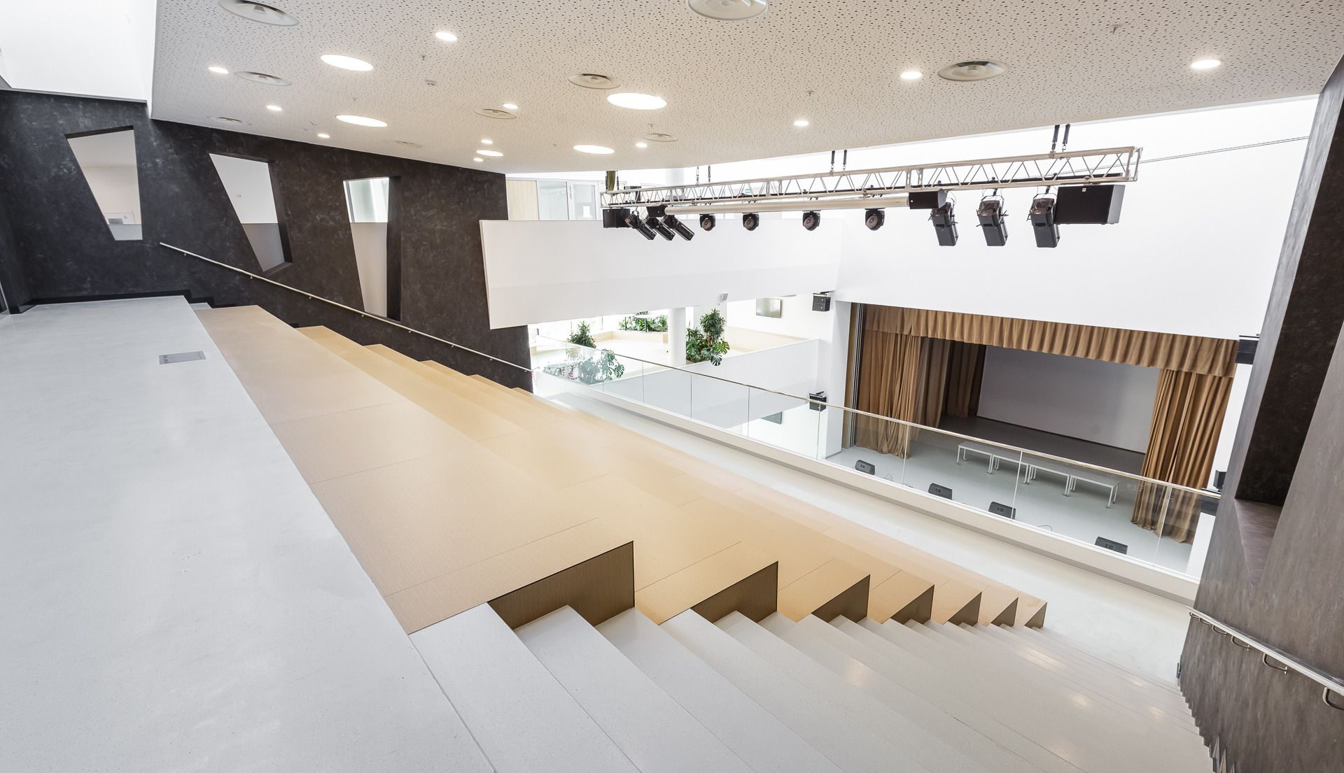
Photo: atrium at “Letovo”
5. Prompts mean directly addressing the motivations and goals of users and indicating the possibility of doing one thing or another. To nudge users towards more beneficial behaviours and extend learning or communication scenarios, it is often sufficient to explicitly state that such behaviours are possible by using captions with appropriate appeals or instructions.
For example, you could explicitly ask users of the school building to use the stairs instead of the lift, show a photo sample of how to assemble a healthy lunch portion, and suggest using reusable drinking bottles instead of cups. To write something on a slate wall or to check if a hat is forgotten when leaving the cloakroom. Don Norman, a well-known psychologist, cognitive scientist, and designer, writes in his book “ The Design of Everyday Things” that good design is distinguished by the presence of not only the possibility of doing something with a thing or an interface (affordance) but also a clear indication, a clue where and how this action should take place (signifier).
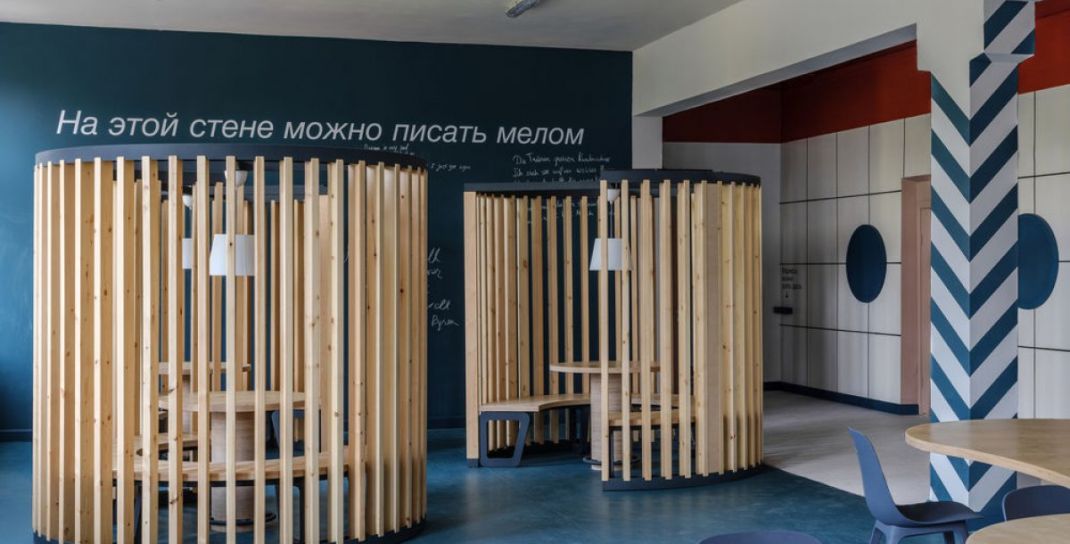
Photo: School n. 57
To summarise: today we can talk about a wide range of tasks solved by the nudging method. These include careful and more conscious use of energy and resources, maintaining cleanliness, recycling, reducing injuries and violence, preventing bullying and smoking, calming down traffic, forming healthy habits, and reducing the frequency of illegal behaviour. To generalise, the key objectives of using nudging in school architecture include:
- Enrichment and diversity of educational experiences and scenarios of using the school environment;
- Increasing mobility and physical activity;
- Increasing psychological well-being;
- Formation of healthier habits, including those related to food and hygiene;
- Minimising health and physical safety risks
Resources and materials:
— Active Design: Shaping the Sidewalk Experience
—15 Examples of Hostile Architecture around the World
— ‘Hostile Architecture’: How Public Spaces Keep the Public Out
— Unpleasant/Hostile Design in our Schools – What spikes do we have?

