Can corridors and stairs encourage children to be physically active? Can canteen organizations influence children’s eating habits? What’s wrong with limiters on school stair railings and door locks? The notion of hostile architecture provides answers to these questions. In the article for EdDesign Mag, Konstantin Seregin, Head of the School Management Laboratory at the National Research University Higher School of Economics (HSE), reflects on hostile architecture and the architecture of choice and writes about how the environment and its design at school can help or hinder children’s learning and development.
About the author: For the last seven years, Konstantin Seregin has been working at the Higher School of Economics and heads the School Management Laboratory of the Higher School of Economics. In the framework of this activity, he has visited many schools in different regions of Russia for research purposes. In the past, he was the Development Director of the Educational Systems Development Centre “Smart School”.
In the discourse on the role of the physical environment in school education, it is usually seen either as an “action space” where different educational scenarios unfold (environment as a stage or frame that sets boundaries and behavioral format), or as a set of capabilities and resources that can functionally enrich the user experience (environment as a Swiss knife or exoskeleton). In this continuum of viewpoints, architecture and design appear as something that is devoid of its own activity and agency, they are silent witnesses of what is happening rather than contributors. But is this always the case? Are there examples of how environmental decisions can become active participants and influence our behavior more than is commonly thought?
Choice architecture
Looking ahead, we answer “yes”, but first we need a bit of theory… In general, everything that we do, how we act, and what choices we make, according to neuro- and behavioural economics is rather just an illusion of choice. And certainly, it is very far from our ideas about our own rationality and free will.
Our decisions and actions are influenced by many factors. Quite often we are simply not aware of many of them: the environmental temperature, blood sugar levels, the colour of the interior, background music, surrounding aromas, etc. And some interiors are specially designed by someone to incline us to favourable (often not for us) behaviour. Recall how interiors are arranged in casinos: lack of natural light and windows, no wall clocks, there are mazes of slot machines, easy access to alcohol and so on. Everything is aimed at making people get lost in the space-time of the gambling hall, stay there as long as possible and, consequently, leave as much money as possible (if you are interested, see Natasha Dow Schüll, “Addiction by design: machine gambling in Las Vegas”).

Anton Gvozdikov / Alamy Stock Photo
Recognising the limited rationality of an average person, Richard Thaler, the winner of the 2017 Nobel Prize in Economics, together with Cass Sunstein, introduced the concept of choice architecture: a special way of constructing and presenting information to people in a decision-making situation. It is designed to reduce irrational and erroneous choices concerning our health, well-being, and welfare, and to nudge us towards more efficient and beneficial choices in the long run. In doing so, it does not directly restrict people in their actions or prohibit anything in any way.
When talking about choice architecture in the context of school education, examples from the field of nutrition are often provided. One such example is a programme designed to help disadvantaged children in the US access free school lunches. Children from poor families were eligible for the programme, but the authorities found that many parents did not sign the necessary paperwork to receive the benefit, either because they simply did not have the time to do so, were busy looking for an income, or because they did not consider themselves competent enough to understand all the legal aspects of the subject matter.
The government then decided to switch from a voluntary participation scheme to a voluntary opt-out scheme: if the school or local authorities know that a family has insufficient funds, the child automatically starts receiving free meals, but the parents retain the right to apply in writing to renounce the benefits. This way, without advertising or large-scale information campaigns, the government managed to provide free school lunches to 15 million children in need.
Here is another example: if in the school canteen vegetable salads are placed at children’s eye level and healthy products are generally easily accessible and unhealthy ones are put further away, this will increase the consumption of salads. And in general, sliced apples are eaten more readily and in larger quantities than whole ones…
Hostile architecture and design
However, architecture is capable not only of nudging but also of repelling, not only of stimulating but also of restraining. The so-called “hostile architecture” is a prime example. You encounter it often without noticing it. For example, when you see a bench at a bus stop, divided into sections by small armrests.

Photo by the author
The purpose of such dividers is not obvious: it is not to separate an area for individual seating but to prevent people from sleeping on those benches, for instance, the homeless.
Alternatively, think of the lampposts covered with chain-link fencing, which is designed to prevent stickers from littering the visual appearance of the streets.

Photo by the author
There are plenty of examples of hostile architecture: from the use of blue light bulbs in public toilets that make it difficult for drug addicts to locate veins and inject, to the use of spikes and small structural elements on kerbs to prevent walls, benches, flowerbeds and railings from being used as skateboarding or kick scootering equipment.
Photo: George Etheredge, The New York Times
The techniques of hostile architecture can be divided into two groups: the creation of functional barriers (often they use repulsive spikes, and thorns) and the removal of opportunity.
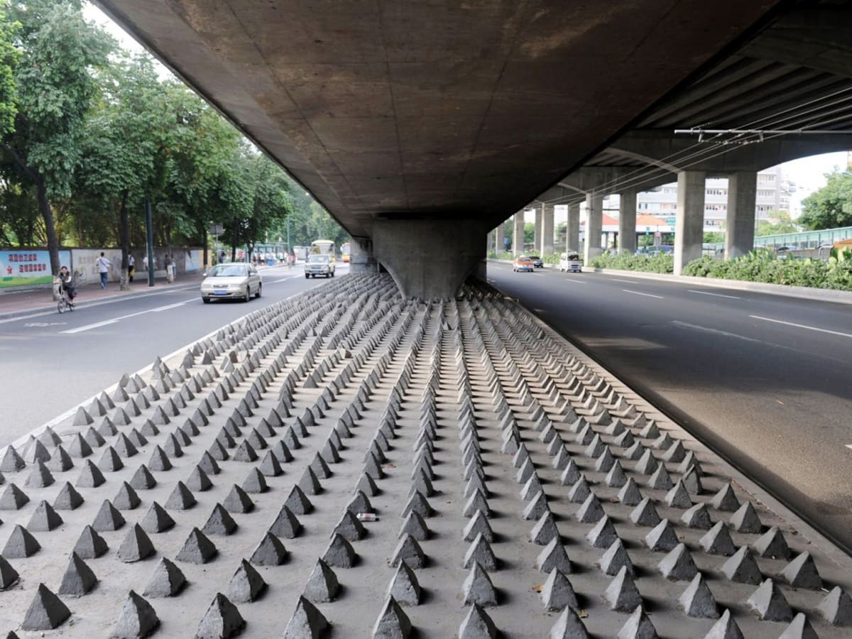
An example of barriers: spikes that prevent unintended parking and prevent homeless people from inhabiting the space under the overpass.

An example of opportunity subtraction: a bench that you can lean on and sit down on, but you can’t lie down or put things on.
In a sense, such architecture is an example of “anti-affordance”: objects and structures explicitly tell us exactly what we cannot do with them, what interaction is unwelcome and impossible. This is the architecture of prohibition and the design of the absence of possibilities. Anti-nudging is not nudging, but repulsion.
Is there a place for such decisions in school? Unfortunately, yes. A vivid example of creating functional barriers in the form of special bumps on the railings to prevent schoolchildren from rolling on them. Or the use of uneven and rough finishing materials in bathrooms to prevent graffiti.

Photo by the author
In general, however, this type of hostile architecture is fortunately not characteristic of the school. Much more often, we encounter instances of removal of opportunity. For example, when entrance doors are removed or fixed in the open position in bathrooms to make these places supervised and prevent smoking.

Photo by the author
Or eliminating openings in bathroom cubicles to avoid involuntary sexting or eliminating Armstrong ceiling tiles to minimise the proliferation of drug “stashes” in schools. In other words, some of these solutions are justified and useful, which is basically what we can say about “Design against crime”.
But often these solutions are not consciously designed but arise simply by oversight. Some parts of the school architecture turn out to be hostile and limit the users’ possibilities not because the designer intended it to be so, but because the users’ interests were simply neglected.
Here are some examples that come to mind:
- The lack of comfortable waiting areas in the entrance area drives parents and visitors out of the school;
- The lack of seats for putting on disposable shoe covers reduces the likelihood of using shoe covers or makes the process of putting them on laborious, especially in winter;
- The lack of secure bicycle parking or scooter parking space reduces the frequency of use of such transport (as do the paths paved with stones on the approach to the school);
- The lack of clear navigation reduces accessibility of certain rooms, and increases time costs;
- The lack of mirrors does not allow you to tidy up your appearance, which is especially important for teenagers with their “imaginary audience effect” (although today we increasingly see mirrors being replaced by smartphone front-facing cameras);
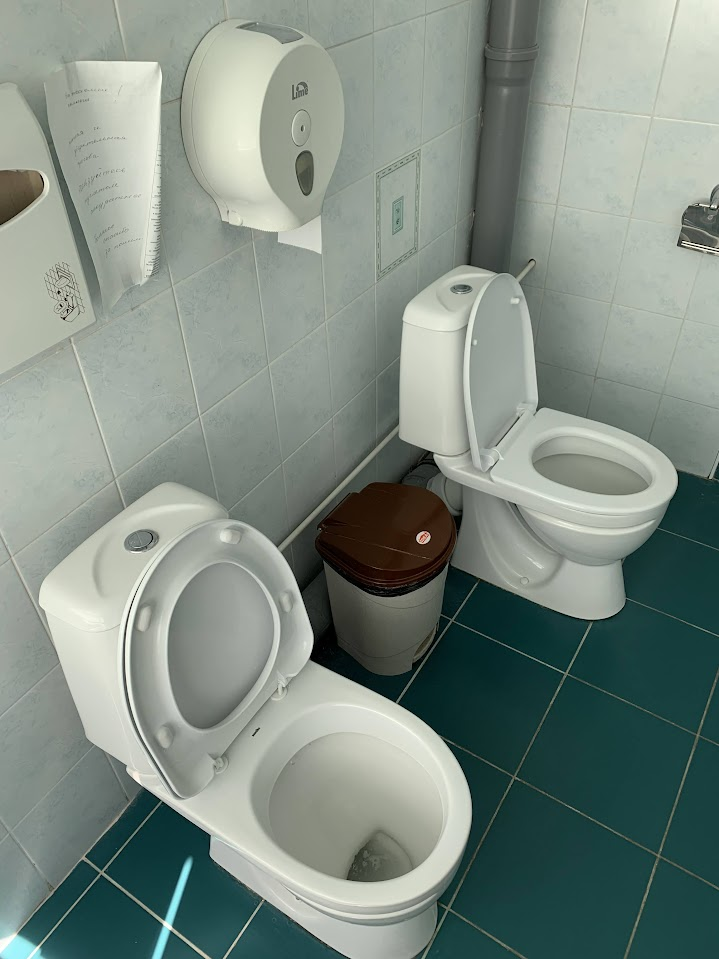
- The lack of partition walls in bathrooms, forcing many pupils to endure the need for bathroom facilities throughout the school day;
Photo by the author
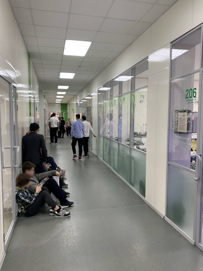
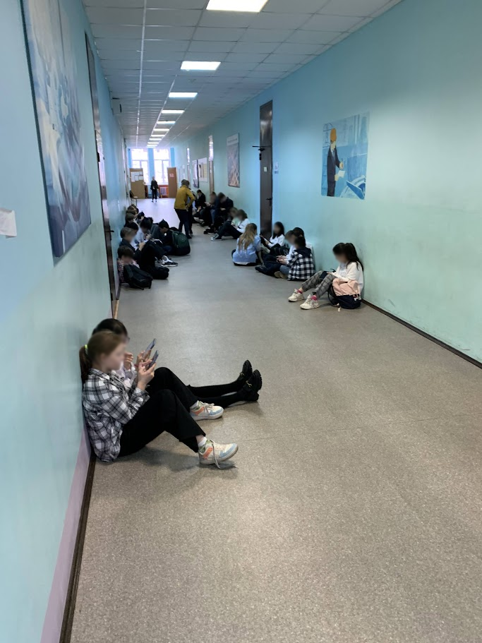
- Long corridors in giant schools with no seating deprive you of the opportunity to rest;
Photo by the author
- The lack of temporary backpack storage areas (“parking lots”) leads to clutter, reduces the security of personal belongings and may increase injury rates;

Photo by the author
- The remote location of certain rooms (teachers’ lounges, recreation rooms, libraries and museums) reduces the frequency of their use;
- No transparent inserts in doors or walls reduces the frequency of accidental communication;
- Non-universal design (e.g., not designed for the visually and hearing impaired, left-handed, overweight, etc.) limits access to information and facilities for certain categories of school users;
- Closed storage of teaching aids, books, gadgets and other learning equipment does not allow children and teachers to use them for their purposes for “here and now”;
- Low-mobility heavy furniture (chairs and desks) in universal classrooms limits the possibility of diversifying lesson scenarios;
- Poor ventilation and unappetising odours in the school canteen discourage even hungry children from eating there…
This list could probably be continued. And if the concept of “educational environment” is interpreted broadly – as a way of life, norms and rules, culture, process and study time organisation, and so on – the list could be even more impressive. But for now, we just thought it important to draw the attention of the professional community to the fact that hostile architecture is a separate phenomenon, which, unfortunately, is also present in the school environment.
It seems that school architecture and design can indeed act as an independent agent of what is happening in education. They can both respond effectively to the needs of school users, encouraging useful and approved behaviour, as well as making the environment hostile and repulsive, limiting the repertoire of behaviour, and preventing some of the needs from being fulfilled.
Resources and materials:
— Active Design: Shaping the Sidewalk Experience
— 15 Examples of Hostile Architecture around the World
— ‘Hostile Architecture’: How Public Spaces Keep the Public Out
— Unpleasant/Hostile Design in our Schools – What spikes do we have?
— From thorns to “mosquito”: what is hostile architecture?
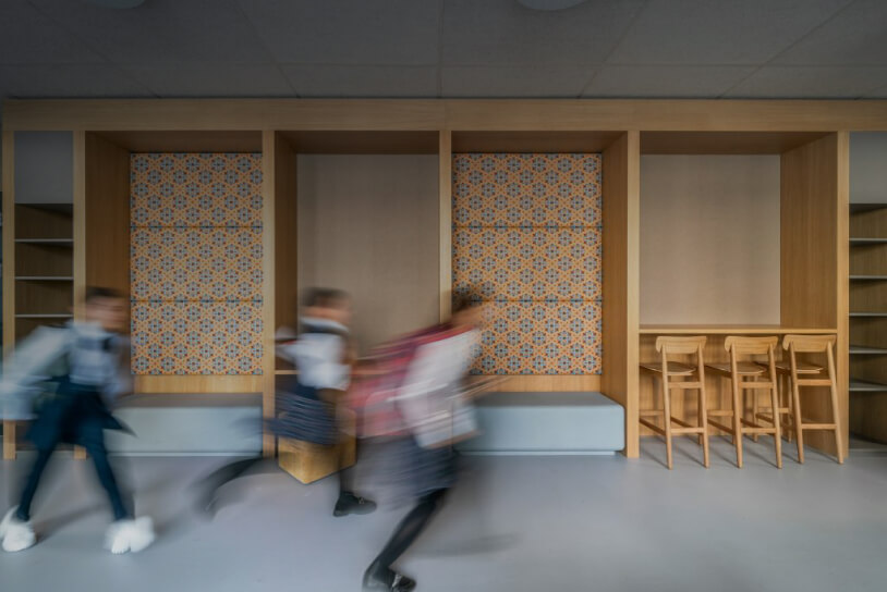
Cover photo: Ku.Be


